This architectural design course deals with design development and detailing of a design problem introduced at the beginning of the semester. The class will focus on an interior renovation of an existing building. ARCH 3511 addresses the next level of design after schematic design: design development.
when showing entourage such as trees and people, try to "dim" them down a bit. for example, it would help if your people in your presentation are either all black or all white, this way it doesn't distract anyone from what you really want to show which is you design.
The section on page 13 is missing the walls in the basement. Your site plan should be zoomed in more to capture more of our specific site rather than the surroundings.
I like how you got the shape for you house and came up with the concept. Some feedback, the trees grass and people take away focus from your design and the story you are trying to tell. Also adding some color to your plans, bathroom elevations, and kitchen elevation would have been great.
Liked the process of shaping your house. Lineweights are a bit too light in the sections and the massings look interesting but are a little hard to read.
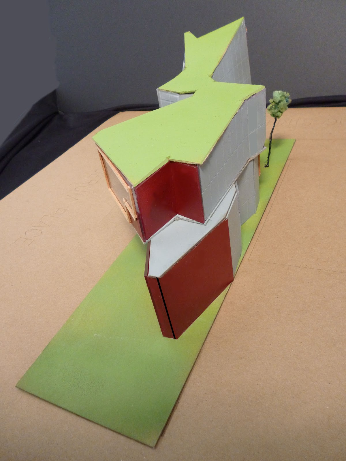
This is a very unique solution to the housing project. I think you were very creative in working with your shipping containers. I think a diagram showing how the shipping containers were used ad manipulated would show your design parti.
The site plan is graphically strong, but it would be nice to show one at a larger scale so that you can see just your site. What you have shown is a context site drawing.
Some drawings are lacking in color - while others are too dark and intense. There needs to be a balance between your drawings so that it looks like one author to this presentation.
The sections are incomplete. They need life - color, furniture,tone, texture.
The floorplans are missing many of the images of the furniture and materials. Your design seems to work throughout your project, based on the angular shape of your building. It is easy to move through the spaces, and the location of one of your bedrooms on the ground floor has allowed for more space for the children rooms.


lineweights are too light
ReplyDeleteon sections
Deletewhen showing entourage such as trees and people, try to "dim" them down a bit. for example, it would help if your people in your presentation are either all black or all white, this way it doesn't distract anyone from what you really want to show which is you design.
ReplyDeleteThe section on page 13 is missing the walls in the basement. Your site plan should be zoomed in more to capture more of our specific site rather than the surroundings.
ReplyDeleteThe Site Plan contains unnecessary trees and crossing zebra. Try to grey out the surroundings and zoom in on the building site
ReplyDeleteI like how you got the shape for you house and came up with the concept. Some feedback, the trees grass and people take away focus from your design and the story you are trying to tell. Also adding some color to your plans, bathroom elevations, and kitchen elevation would have been great.
ReplyDeleteIt'd be nice to add a title to each board, explaining what it's about.
ReplyDeleteLiked the process of shaping your house. Lineweights are a bit too light in the sections and the massings look interesting but are a little hard to read.
ReplyDeleteUse light colors for renders, sometimes neutral color can do the job,Renders looks good
ReplyDeleteThe material on the renderings are a little dark.
ReplyDeleteThis is a very unique solution to the housing project. I think you were very creative in working with your shipping containers. I think a diagram showing how the shipping containers were used ad manipulated would show your design parti.
ReplyDeleteThe site plan is graphically strong, but it would be nice to show one at a larger scale so that you can see just your site. What you have shown is a context site drawing.
Some drawings are lacking in color - while others are too dark and intense. There needs to be a balance between your drawings so that it looks like one author to this presentation.
The sections are incomplete. They need life - color, furniture,tone, texture.
The floorplans are missing many of the images of the furniture and materials. Your design seems to work throughout your project, based on the angular shape of your building. It is easy to move through the spaces, and the location of one of your bedrooms on the ground floor has allowed for more space for the children rooms.