This architectural design course deals with design development and detailing of a design problem introduced at the beginning of the semester. The class will focus on an interior renovation of an existing building. ARCH 3511 addresses the next level of design after schematic design: design development.
I understood the concept and your idea...I understood that the facade and the tiles you choose were based off the sky and stars. Try to align you images, stay away from the "collage style" When you align your images to eachother it becomes easier to read because it is consistant. Overall, I think with a little more time and some final touches, your presentation would have been stronger.
Really liked your master bathroom elevations (wood bathroom) but couldn't understand your side elevations. Also, like Enny said, by aligning your images, the board will look more organized and easier to read.
ALthough the project look very interesting, its a like hard to follow the presentation, try to use low tone color and if you tag the view it would help you explain the project a bit more clear
I liked your blue bathroom & how you took out time to make the 2 bathrooms different. Is that supposed to be brick on your toilet in the other bathroom?
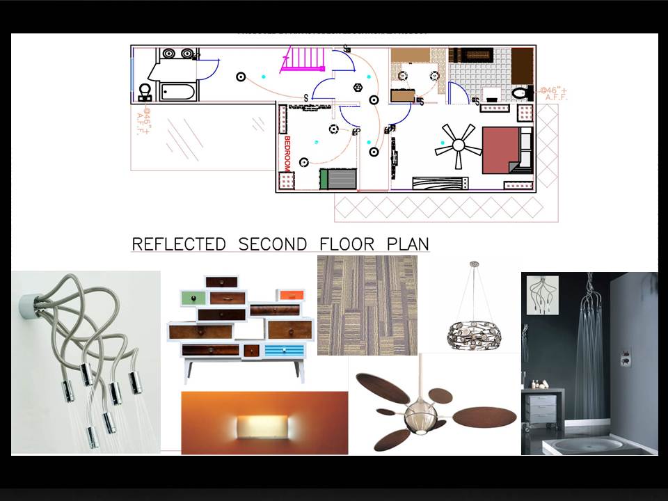
A few things to help improve your presentation: Drawings should be black and white and rendered - the lines should black - not colors like ACad. Do not show the long elevations - as they are next to existing buildings and will not be seen - unless there is something about your design to show. All your floorplans should be the same size/scale - and organized on the same spot on each drawing. What are the Materials of the elevations? The images of the furniture and materials should be with the drawings


cant understand side elevation
ReplyDeleteThis comment has been removed by the author.
DeleteAgree with Oscar
DeleteNice bathroom elevations but the bath doesn't look proportional
ReplyDeleteI understood the concept and your idea...I understood that the facade and the tiles you choose were based off the sky and stars. Try to align you images, stay away from the "collage style" When you align your images to eachother it becomes easier to read because it is consistant. Overall, I think with a little more time and some final touches, your presentation would have been stronger.
ReplyDeletei couldnt understand you elevations like oscar said.
ReplyDeleteReally liked your master bathroom elevations (wood bathroom) but couldn't understand your side elevations. Also, like Enny said, by aligning your images, the board will look more organized and easier to read.
ReplyDeleteALthough the project look very interesting, its a like hard to follow the presentation, try to use low tone color and if you tag the view it would help you explain the project a bit more clear
ReplyDeleteI liked your blue bathroom & how you took out time to make the 2 bathrooms different. Is that supposed to be brick on your toilet in the other bathroom?
ReplyDeleteA few things to help improve your presentation:
ReplyDeleteDrawings should be black and white and rendered - the lines should black - not colors like ACad.
Do not show the long elevations - as they are next to existing buildings and will not be seen - unless there is something about your design to show.
All your floorplans should be the same size/scale - and organized on the same spot on each drawing.
What are the Materials of the elevations?
The images of the furniture and materials should be with the drawings